
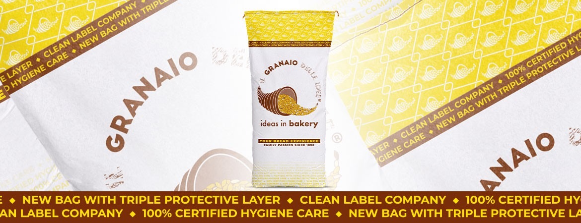
Graphic redesign for Il Granaio delle Idee bags
Il Granaio delle Idee packaging has undergone a graphic redesign to highlight the themes most important to the company in 2020, now also expressed on the bags through English keywords. This choice also reflects Il Granaio delle Idee's strong drive towards international expansion in recent years.
The chosen keywords
The English keywords featured on the packaging of our bakery mixes can be found on two bands encircling the bag: an upper band with a brown background and a lower band with yellow lettering. Brown and yellow are our official corporate colours. But what concepts do they convey?
> 100% certified hygiene care: expressing our ongoing commitment to food safety, having achieved BRC and IFS certifications with the highest ratings.
>New bag with triple protective layer: we have chosen packaging with a triple protective layer. A first layer of paper, suitable for contact with food products; a second layer of plastic, to protect the product from moisture; and a third layer of paper, for extra reinforcement and customised graphics.
>Clean Label Company: since our foundation, we have been proud to be a clean label company. Our products contain no chemical or synthetic additives and, thanks to our twenty years of experience in enzyme technology applied to baking, we produce natural, professional mixes for bread, pizza and pastry.
Our visual identity stays true to itself
This redesign has enhanced the essence of our visual identity, and our bags continue to make information easy to access. All technical product information (characteristics, ingredients and dosage) remains on the back. The new company logo, launched at the beginning of 2020, and the company symbol, a cornucopia on a yellow background, make the bags instantly recognisable. The new bag will be used for all our 10 and 25 kg formats, covering our complete mixes, the Nucleo® range and natural baking aids.